OneGame - Your Ultimate Gaming Companion
Never lose track of your gaming journey again.

This case study explains the thought process, research, and design journey behind OneGame — a mobile app that helps gamers log their games, track progress, and discover similar titles based on their interests. Created as a personal project, OneGame blends UI/UX strategy with a love for gaming.

Role

Role

Role

UI/UX

Designer

UI/UX

Designer

UI/UX

Designer

Project Type

Project Type

Project Type

Personal

Project(Solo)

Personal

Project(Solo)

Personal

Project(Solo)

Duration

3 weeks

Duration

Duration

4 weeks

4 weeks

Platform

Platform

Platform

Mobile App

Mobile App

Mobile App

Tools Used

Tools Used

Tools Used

Figma

Figma

Figma

ChatGPT

ChatGPT

ChatGPT

Project Overview

Gamers often find themselves hopping from platform to platform, trying to remember what they’ve played, what’s pending, and what they’d love next. OneGame solves this by acting as a smart digital game library that not only helps you track your progress but also recommends new games based on your taste.


It’s not a platform to play games, but a companion app to manage your gaming universe in one neat space.

Problem Statement

Gamers today face three key challenges:

  • Losing track of games they've played, want to play, or are currently playing

  • Constantly jumping across platforms and review sites to discover games

  • Getting overwhelmed with irrelevant or repetitive recommendations


The goal was to design an app that:

  • Organizes your gaming journey efficiently

  • Offers reliable, preference-based recommendations

  • Feels intuitive, fun, and clutter-free

Design Process

To ensure a structured and user-first approach, we followed the Design Thinking Process, which includes:

  1. Empathize — Research Your Users' Needs

  2. Define — State Users' Needs and Problems

  3. Ideate — Generate Creative Solutions

  4. Prototype — Build to Think

  5. Test — Validate with Real Users


Each stage is supported with clear insights, visuals, and real user feedback to guide the design.

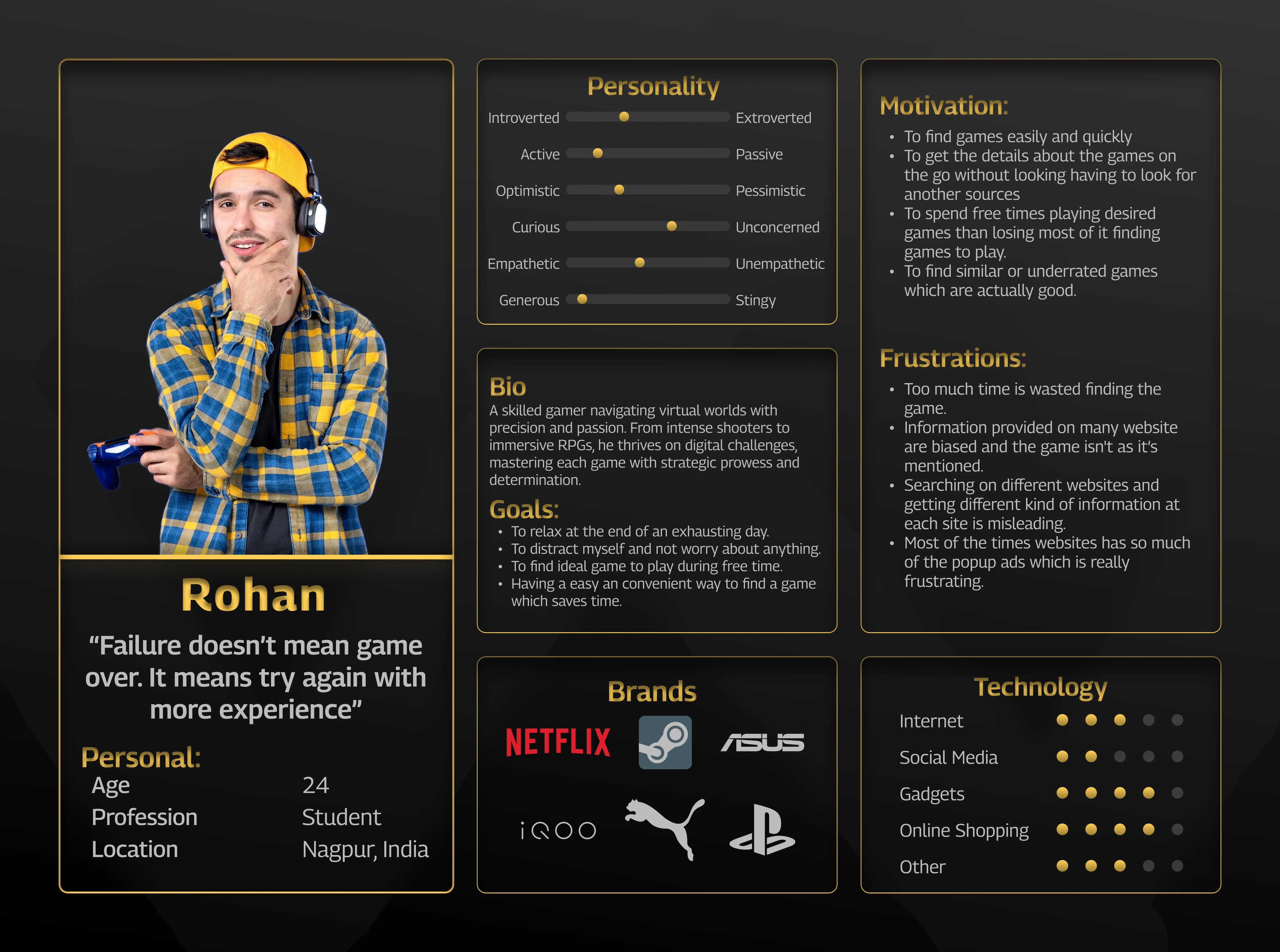
Stage 1: Empathize — Research User Needs

Understanding gamers to design with empathy.

Understanding gamers to design with empathy.

Before diving into design, I needed to understand the real frustrations and desires of everyday gamers. As this was a solo personal project, I independently conducted both qualitative and quantitative research to deeply explore user behaviors, goals, and pain points. This stage helped build a strong foundation for a user-centric product.


Quantitative Analysis

To validate assumptions and identify patterns, I conducted online surveys with casual and serious gamers. These surveys helped gather data around how players discover new games, organize their collection, and what influences their decisions.


Findings:

  • 67% of users rely on multiple platforms to track and discover games.

  • 52% have trouble remembering which games they own or want to play.

  • 40% feel overwhelmed by the number of game choices on different platforms.


This helped me validate the need for a centralized space to track, review, and discover games.


Qualitative Analysis

I had open-ended discussions with gamers in my circle (friends and online community members). This gave me rich insights into user frustrations, emotions, and behavior.

Findings:

  • Users felt lost switching between Steam, Epic Games, and other platforms.

  • They wanted personal recommendations that go beyond genre tags.

  • Most relied on friends or YouTube creators for trusted game reviews.


These insights pushed me toward creating a personalized, clutter-free experience with features like game tracking, smart recommendations, and detailed game metadata.


Empathy Mapping

To put myself in the users’ shoes, I created a detailed empathy map based on my research. Here's what emerged:

Says:

  • “Which game should I buy?”

  • “Is there any special discount available?”

  • “Will this run smoothly on my device?”

  • “I want a game that helps me escape reality.”


Thinks:

  • “Hope it matches my mood or preferences.”

  • “Will this game challenge me enough without being too frustrating?”

  • “Is this worth my time and money?”

  • “Can I connect with other players through this?”


Does:

  • Searches forums, watches gameplay videos, checks Reddit and reviews.

  • Joins gaming groups, uses filters to explore titles, and follows creators for game updates.


Feels:

  • Excited to discover new experiences.

  • Anxious about wasting time or money.

  • Curious about mechanics and community.

  • Frustrated by overwhelming options.


Gains:

  • Discovering games they love.

  • Getting emotionally invested in stories and challenges.

  • Connecting with other players.


Pains:

  • Too many options leading to decision fatigue.

  • Mistrust in reviews.

  • Bugs or poor optimization.

  • Toxic online communities.


Creating this map helped me better understand my audience’s emotional and decision-making journey, which was crucial for building the right tone, interface, and structure in the final product.


Competitive Analysis

To understand industry standards and gaps, I analyzed 4 major platforms:

  • Steam – Huge library and community features, but interface can feel cluttered.

  • Epic Games Store – Exclusive titles and sales, but lacks tracking and social features.

  • Microsoft Store – Offers cross-platform games, but has limited discovery tools.

  • Battle.net – Great for Blizzard titles but lacks variety and personal recommendations.


What I Learned:
There was no platform that offered a centralized, minimal, and personalized way to track played games and get recommendations. This helped define OneGame’s unique value proposition.

Stage 2: Define — State Your Users' Needs and Problems

From insights to clarity: defining what users truly need.

From insights to clarity: defining what users truly need.

In this stage, we synthesized everything learned during the Empathize phase to clearly define the problems our users are facing. Instead of jumping into solutions, we focused on truly understanding the pain points, expectations, and goals of our users.


This phase helped ensure that our design decisions would be grounded in real user needs—not assumptions. It created a focused path for ideation, ensuring every feature added value.


User Personas

Based on the empathy maps and research, I created detailed user personas to represent core audience segments. These personas helped us maintain empathy throughout the design process and guided every interaction we built.


Why We Used It:
To humanize the data and ensure our designs served realistic user goals and challenges.


How It Helped:
The personas clarified specific motivations—like wanting recommendations based on previous games—and key frustrations—such as constantly switching between platforms or not finding trustworthy reviews. This focused the solution on discovery, comparison, and personalization.

Problem Statements

Based on the user research and persona analysis, we defined the following problem statements:

  1. Users struggle to find new games that match their preferences.
    They spend too much time browsing multiple platforms and still feel unsure about their choices.

  2. Users find it hard to keep track of the games they’ve already played or own.
    There's no single place to manage their gaming history or organize their backlog.

  3. Users want game suggestions based on personal taste and gameplay experience.
    General trending lists or paid promotions on existing platforms don’t serve their needs well.

User Needs

  • A personalized game recommendation system based on games they already like.

  • A central game library to track played, playing, and wishlisted games.

  • Authentic, unbiased reviews to evaluate games before investing time or money.

  • A streamlined browsing experience without needing to switch between platforms.

Stage 3: Ideate — Challenge Assumptions and Create Ideas

Stage 3: Ideate — Challenge Assumptions and Create Ideas

Stage 3: Ideate — Challenge Assumptions and Create Ideas

Exploring all possibilities before picking the best path forward.

Exploring all possibilities before picking the best path forward.

After clearly defining user problems, the Ideate stage was about generating a wide range of ideas and potential features without self-limiting. The goal wasn’t to find the solution right away—but to explore many directions before narrowing down the best one.


This process helped push creative thinking and avoid defaulting to common patterns found in existing platforms. It encouraged questioning: What if game discovery could be smarter? Simpler? More personalized?

User Scenarios

We created real-life scenarios that reflected how different types of users would interact with the app. For example:

"A user finishes a game and wants to find a new title that’s similar but with a richer narrative. They open OneGame, filter by story-driven games, and get personalized recommendations based on past preferences."

Why We Used It:
To understand how users would interact with features in context.

How It Helped:
Helped us imagine and validate what kind of features would actually be used—and where users might get stuck.
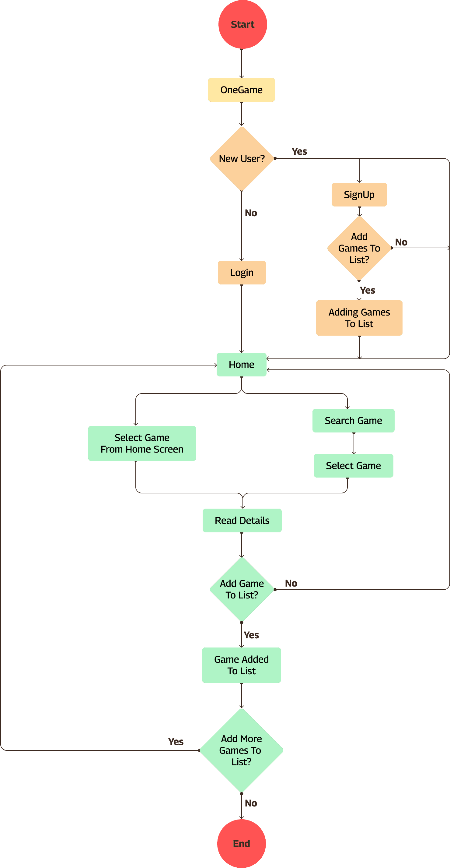
User Flows

We mapped out how a user would move through the app to complete specific tasks, like:

  • Adding a game to their library

  • Discovering new games based on mood or genre

  • Checking reviews and ratings before making a decision


Why We Used It:
To ensure the journey was intuitive and seamless.


How It Helped:
Exposed areas where too many steps or missing options could cause user frustration. This helped shape smoother, goal-oriented navigation.

Information Architecture

We organized the app’s structure to ensure all features were easily accessible and grouped logically. The main sections were:

  • Home — Personalized dashboard with game suggestions, highlights, and updates.

  • Explore — Browse and search games by genre, mood, popularity, or new releases.

  • Discussion — A community space for users to post, comment, and discuss game experiences, reviews, and tips.

  • Notification — Updates about game launches, friend activity, community replies, or wishlist availability.

  • My List — A personal library to manage games under Played, Playing, Wishlist, and Backlog categories.


Why We Used It:
To create a layout that aligned with user mental models and expectations based on how they typically interact with gaming content.


How It Helped:
Reduced cognitive load by creating a focused, purpose-driven structure. Users could instantly identify where to go for discovery, interaction, or personal tracking—without unnecessary clutter or confusion.

Card Sorting

We used card sorting (internally) to decide what kind of categories and filters users would expect under the Recommendations and Library sections.

Why We Used It:
To reflect how users naturally categorize game types, preferences, and play status.

How It Helped:
Helped structure the filters and tabs in a way that felt intuitive—for example, organizing genres vs. play modes, or differentiating between wishlist and backlog.

Storyboard

We illustrated a quick story of a typical user’s journey—starting from the frustration of not knowing what to play, discovering OneGame, and finally finding the perfect game without hassle.

Why We Used It:
To visualize emotions and actions at each step in a user's journey.


How It Helped:
Made it easier to communicate the app’s value proposition to stakeholders and guide design tone.

How This Stage Helped the Design

The ideation stage helped transform vague needs into real, usable features. For example:

  • The idea of a smart recommendation engine came from analyzing user frustration with random, irrelevant suggestions.

  • The wishlist/play history/game library stemmed from user confusion about tracking their progress across games.

  • The intuitive flow and IA ensured that users could find what they needed within 2–3 taps.

Stage 4: Prototype — Start to Create Solutions

Turning structure into tangible designs.

Turning structure into tangible designs.

After finalizing the structure and flows, I began translating the ideas into low-fidelity wireframes. This step helped me visualize the layout, interactions, and overall feel of the app before investing time in visual design.

Wireframes

Wireframes acted as the backbone of the user interface. They allowed me to focus on layout and functionality without getting distracted by colors or visual elements.

Here’s what I focused on while wireframing:

  • Clarity in layout: Ensuring each screen had a logical, intuitive structure.

  • Consistent navigation: Keeping navigation patterns predictable across pages.

  • Minimal clutter: Giving each section breathing space for better usability.

  • Function-first design: Focusing on what the user needs to do on each screen.

How Wireframing Helped Me in the Project:

Creating wireframes allowed me to test the usability of my ideas early on. I could identify flaws in navigation or layout before investing time in visuals. This helped me streamline the experience and improve the hierarchy of content. It also made team discussions and feedback more efficient since the focus was entirely on structure.

Stage 5: Test — Try Your Solutions Out

Making sure the experience works for real users.

Making sure the experience works for real users.

Once I had the wireframes and mockups ready, I moved on to user testing. Since this was a personal project, I conducted informal usability walkthroughs with a few friends and peers who are active gamers. I also did multiple self-evaluations of the flow and structure to simulate new user experiences.

What I Focused On During Testing:

  • Ease of navigation: Can users quickly move between home, explore, and list sections?

  • Clarity of CTAs: Are buttons like “Add to List” or “Start Discussion” easy to spot and understand?

  • Content organization: Do game details, reviews, and suggestions appear in the right order?

  • Aesthetic usability: Does the interface feel visually comfortable and consistent?

Insights from Testing

Testing helped me spot several areas of improvement:

  • Users were confused between Discussion and Explore sections → I improved tab naming and icons.

  • Some CTAs felt too small or hidden → I refined button placements and sizing.

  • The home screen felt slightly overwhelming → I simplified the layout and moved non-essential cards to secondary views.

Why Testing Matters in Design

Testing ensured that the solution wasn't just a theoretical idea, but a practical and usable product. It helped me validate that:

  • The app solves a real user need

  • The experience feels smooth and intuitive

  • Any major usability issues were caught before the final design


By iterating based on real feedback, I saved future rework and ensured that the design truly resonated with its target audience.

Visual Design — Bringing It All Together

Where structure meets style and everything starts to feel real.

Where structure meets style and everything starts to feel real.

Logo Design

Before I began visual design, I first needed to come up with the right name for the app— OneGame. The idea was to convey unity, simplicity, and a single destination for all gaming needs. The name reflects the core mission: helping players discover the one game they'll love based on what they’ve already played.

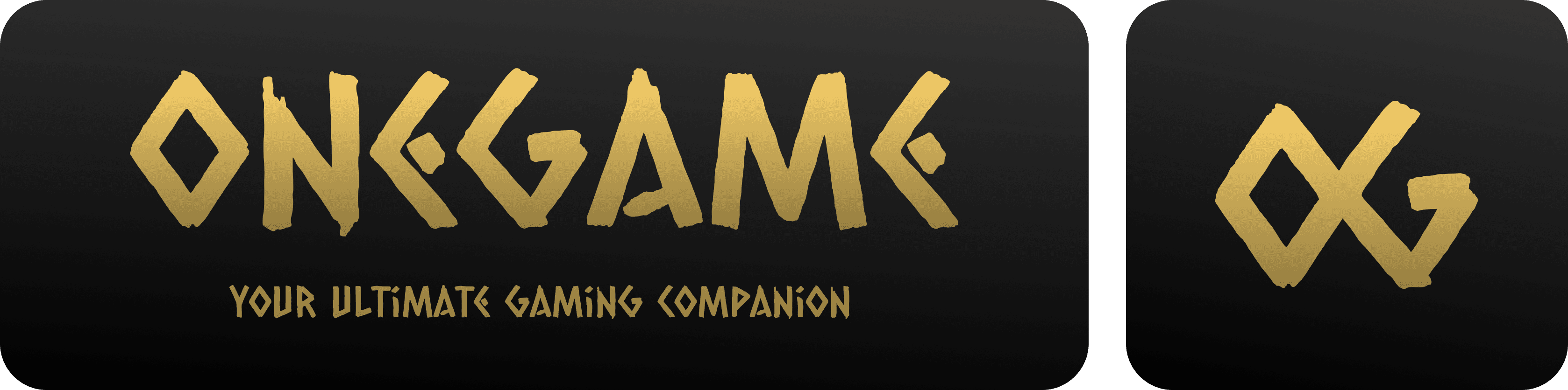
I designed a monogram logo using the initials OG, with negative letterspacing. The O and G overlap to form an X, symbolizing the idea of finding something, much like solving for the unknown in algebra. This subtle visual metaphor made the logo feel thoughtful while keeping it sleek and minimal.


To complement the logo, I chose the Caesar Dressing font for the display text. It's a playful and distinctive typeface created by Crystal Kluge, known for its hand-drawn, vintage signage feel. It gave the brand a unique personality—fun, expressive, and informal—aligning well with the vibe of a creative gaming companion.


Together, the name, logo, and font created a strong visual identity for OneGame: a smart, personal, and engaging platform made for gamers, by a gamer.


Tagline: Your Ultimate Gaming Companion

Typography & Fonts

For the typography, I went with Roboto, a clean and modern sans-serif typeface. It’s widely used in digital interfaces for its excellent readability across screen sizes, and it felt like the right fit for a product aimed at both casual and serious gamers.

Roboto helped strike the balance between professionalism and playfulness—perfect for a gaming companion app. It offered clarity in long-form content like game descriptions, while still feeling bold enough for headers and buttons.


  • Heading Font: Roboto Bold – adds hierarchy and structure while keeping the design visually strong.

  • Body Font: Roboto Regular – ensures a smooth, easy reading experience across all sections of the app.


The consistent use of Roboto throughout the app helped maintain visual harmony and accessibility, two key aspects of my design philosophy for OneGame.

Color Palette

The OneGame app uses a Black and Gold color palette to reflect elegance, sophistication, and a premium gaming experience. This combination was chosen to give the app a sense of exclusivity and maturity—something that resonates with gamers who are intentional about their choices.

Background Gradient: #333333 → #000000

Provides a modern, immersive, and distraction-free environment, making the visuals and game content stand out.

Primary Accent Gradient: #FBD36C → #957D40

Adds a touch of luxury and premium feel, highlighting key UI elements like buttons and CTAs.

Text Colors:

Text Colors:

Text Colors:

#FFFFFF for headings and titles to ensure high readability.

#BBBBBB for body text to maintain visual hierarchy without straining the eyes.

List Button Status Colors:

List Button Status Colors:

List Button Status Colors:

Playing: #107C10

Fresh and active, signaling current engagement.

Completed: #0085FF

Clean and positive, showing completion with clarity.

Plan To Play: #454545

Neutral tone that doesn’t distract.

On Hold: #8E8000

A muted yellow to indicate pause or pending status.

Dropped: #640000

Deep red, subtly marking disengaged or abandoned titles.

This palette balances visual richness with functional clarity, making sure the app looks stunning while staying usable and accessible.

Iconography

Icons were an important part of navigation. I used simple line icons with a consistent stroke weight to keep the UI unified and clear. Each icon was designed or chosen to match the tone of the app: playful yet precise.

Iconography

Icons were an important part of navigation. I used simple line icons with a consistent stroke weight to keep the UI unified and clear. Each icon was designed or chosen to match the tone of the app: playful yet precise.

Iconography

Icons were an important part of navigation. I used simple line icons with a consistent stroke weight to keep the UI unified and clear. Each icon was designed or chosen to match the tone of the app: playful yet precise.

Final Screen Designs

Here’s how the design came to life across the key pages:
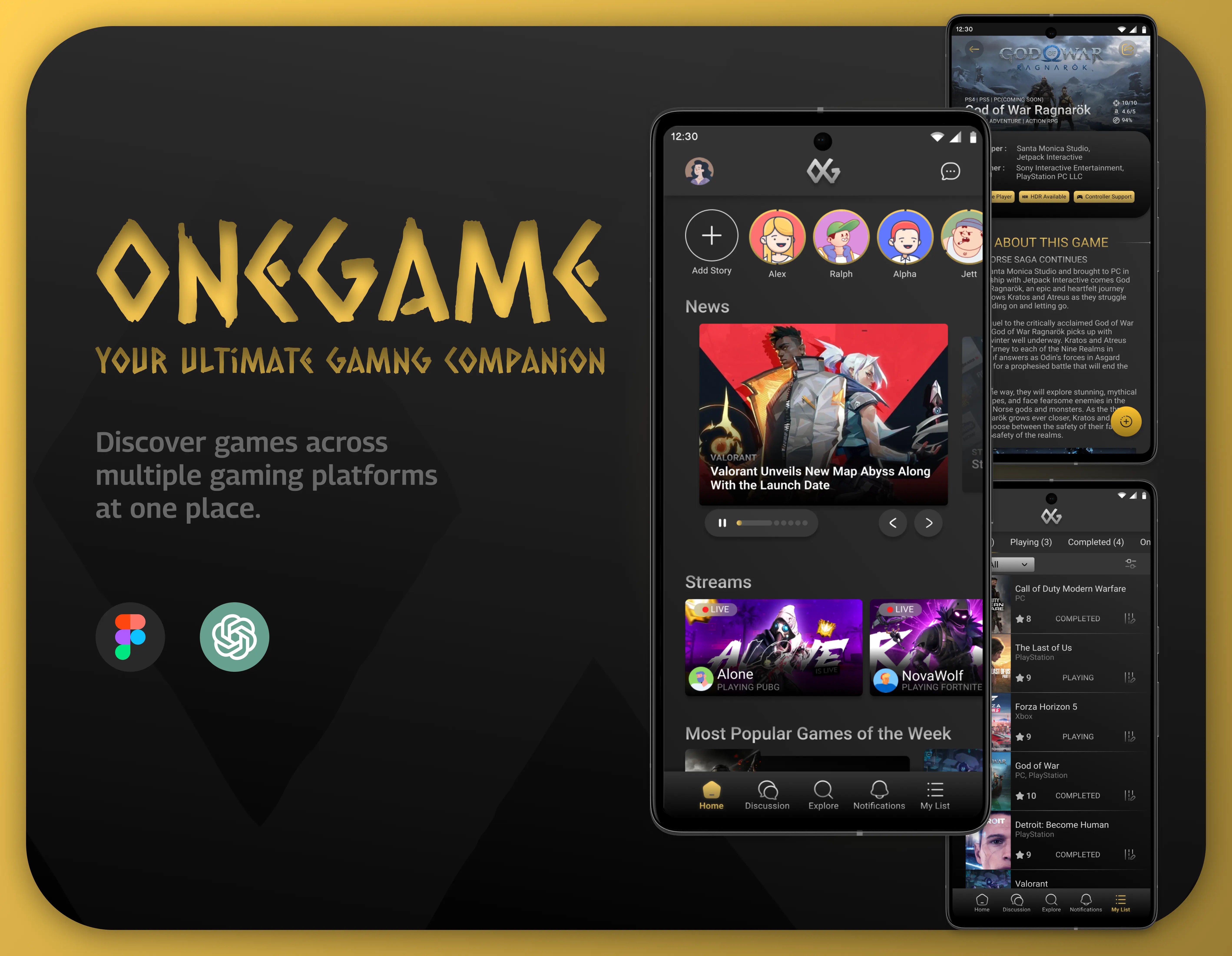
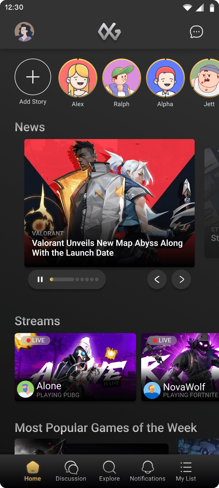
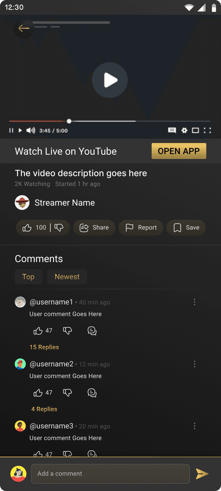
Home Page

The Home Page welcomes users with personalized game recommendations, trending titles, and quick access to their game library. It is designed to immediately capture attention while maintaining usability through a balanced mix of visuals and content.


  • Designed to engage users from the moment they open the app

  • Featured cards for game suggestions, recent highlights, and top-rated picks

  • Clean layout to keep browsing effortless

  • Direct links to other key pages such as:

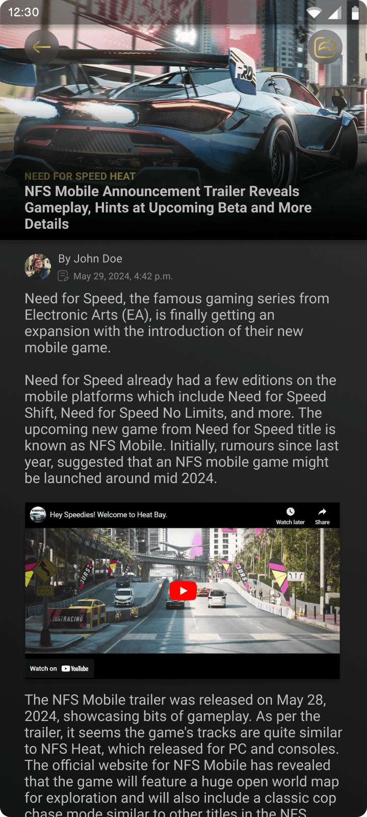
    • News Page – for the latest updates, patch notes, and game announcements

    • Game Details Page – to explore in-depth information, trailers, and reviews for individual games

    • Streams Page – where users can discover live or recorded streams of games they’re interested in


This interconnected design ensures users are never more than a tap away from discovering new content or immersing themselves in the wider gaming experience—making exploration both intuitive and rewarding.
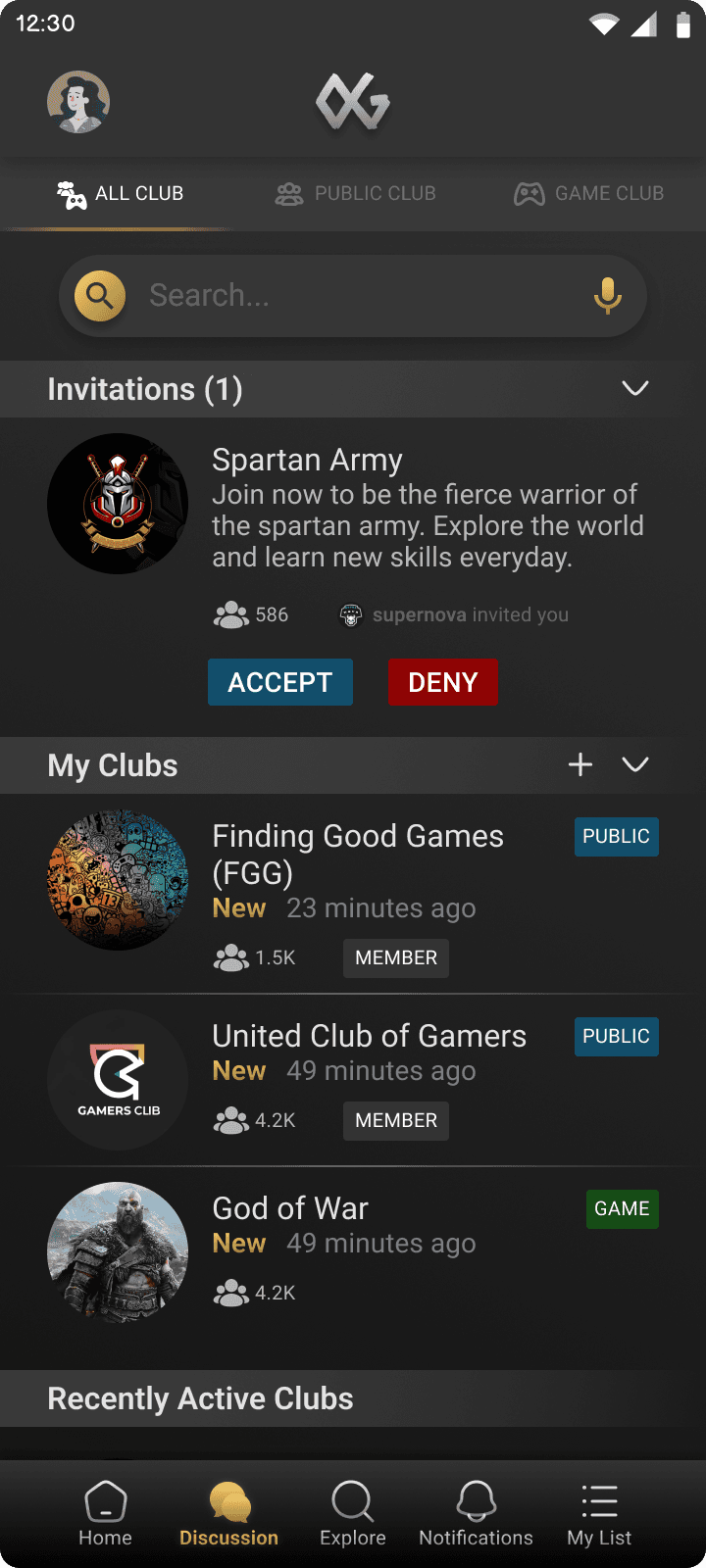
Discussion Page

The Discussion Page is designed as a community hub where gamers can connect, share, and dive deep into conversations.


  • Users can join Game Clubs, which are discussion spaces dedicated to specific games—ideal for sharing tips, discussing bugs, uncovering Easter eggs, and more

  • Users can also join or create Private/Public Clubs, where they can connect with friends or like-minded gamers for casual conversations or focused discussions

  • Focused on readability and engagement, the layout mimics traditional forums while adding a clean, modern UI

  • Features include reply counts, trending tags, and indicators for unread threads


This page plays a key role in building a strong sense of community within the app, transforming passive players into active contributors. It brings together gamers who not only want to play—but share, learn, and grow together.
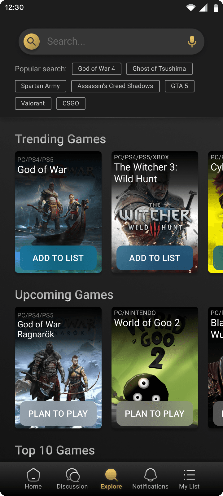
Explore Page

The Explore Page is the heart of game discovery on OneGame. It's designed not just to help users find new titles, but also to manage their gaming journey more effectively.


  • All games are displayed with a clean, card-based layout, allowing users to browse effortlessly using filters like genre, platform, rating, and more

  • Users can directly add games to their list, whether they’ve completed, are currently playing, or plan to play in the future

  • For upcoming game releases, users can add them to the “Plan to Play” section to get notified as soon as the game is released

  • Game cards show quick stats, genre tags, and user ratings to help in fast decision-making

  • This page also showcases Game Clubs and Public Clubs, allowing users to instantly join communities related to the games they're exploring


The Explore Page transforms what is usually a cluttered search experience into a curated, user-controlled discovery journey, ensuring users never miss a game they’d love to play.
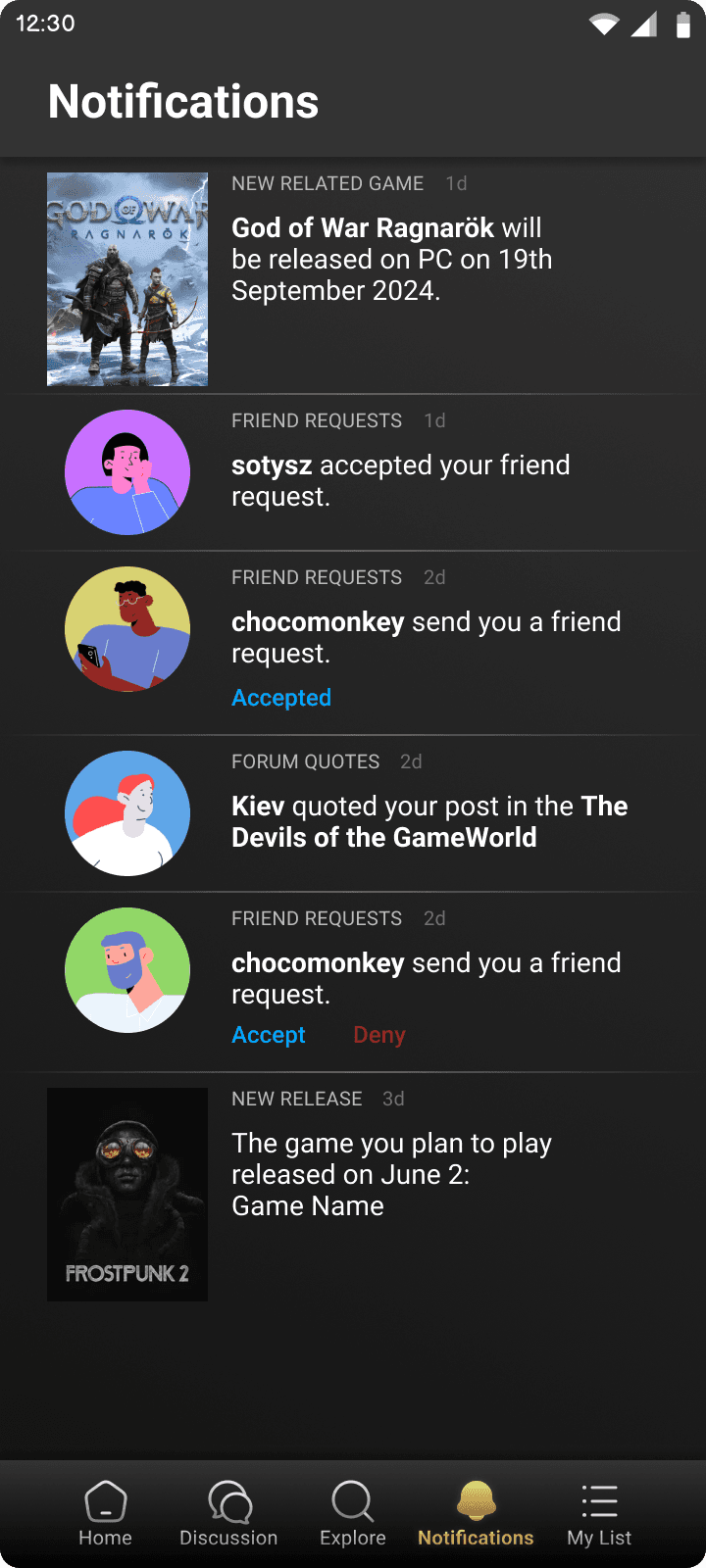
Notification Page

A centralized place to keep users updated and engaged with everything happening around their gaming interests.


  • Displays real-time alerts like new game releases, friend requests, forum mentions, and quotes from discussions

  • Notifies users about upcoming game releases they've marked in their Plan to Play list

  • Smart recommendations under "You Might Like" based on user preferences and past gameplay

  • Designed with clear visual hierarchy, using icons and subtle animations to differentiate between read and unread notifications

  • Enables users to take quick actions—accept requests, view club replies, or jump to the game detail screen directly


This page ensures users always stay informed and connected, enhancing engagement without feeling overwhelmed.
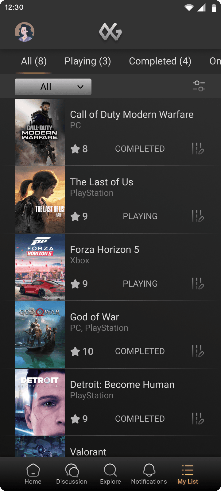
My List Page

Your personalized game tracker — all in one organized space.


  • This page stores all the games users have added to their list, divided into helpful sections:

    • All Games

    • Playing

    • Completed

    • On Hold

    • Dropped

    • Plan to Play

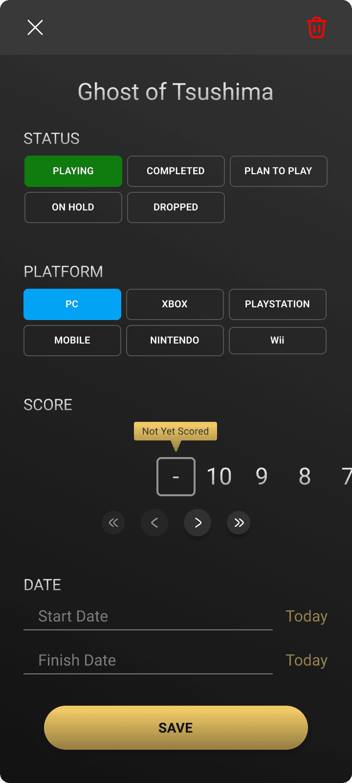
  • Each game entry allows users to:

    • Update the game’s status (e.g., from Plan to Play → Playing → Completed)

    • Select the platform they are playing the game on

    • Rate the game out of 10 based on their personal experience

    • Add start and end dates to track their gaming timeline

  • Built using a clean, grid-based layout for quick browsing and easy management

  • Designed for simplicity and control, making it seamless to review and organize one's game journey


This page empowers users to reflect on their gaming habits, stay organized, and get a sense of progress and accomplishment.

Why Visual Design Matters

Visual design is more than just aesthetics—it’s about communicating function clearly and intuitively. Through color, spacing, hierarchy, and branding, I created a UI that:

  • Builds trust and engagement

  • Guides users through complex interactions smoothly

  • Aligns with gamer expectations while adding fresh value


The visual design tied all my research and wireframes together into a final product that not only works—but looks and feels like something users would enjoy using every day.

Outcome

Building OneGame from the ground up helped me translate a common gamer frustration into a structured, thoughtful, and usable solution. The app successfully solved the problem of scattered game tracking and discovery. Instead of jumping between multiple platforms like Steam, Epic Games, and forums, users could now stay in one place — managing their entire gaming journey and exploring new games tailored to their taste.


By focusing on clean UI, intuitive UX flows, and smart features like AI-driven recommendations, personalized notifications, and club discussions, I created a companion app that’s both fun and functional. The user testing phase validated my approach — with most testers appreciating the ease of use, aesthetics, and the convenience of having everything in one place.

Key Learnings

This project offered me a chance to apply the entire User-Centered Design Process independently — from research to final visuals. Some of the most valuable takeaways were:

  • Importance of Empathy: Creating empathy maps and personas helped me step into the shoes of real users and make design choices that truly catered to their needs and struggles.

  • Clarity through Information Architecture: Defining clear flows and organizing content made the app easier to navigate, especially for new users unfamiliar with game discovery tools.

  • Consistency Matters: Using a unified color palette, typography, and visual language reinforced the app’s identity and helped users feel grounded throughout their experience.

  • Prototyping & Testing: Early wireframes and mockups allowed me to receive fast feedback. Minor changes — like CTA placement or notification visibility — had a major impact on usability.

  • Working Solo: Managing everything on my own—from strategy to visuals—strengthened not just my design skills but also my ability to plan, prioritize, and self-critique.

Final Thoughts

OneGame wasn’t just a design exercise—it was a personal exploration of how much value a single well-designed tool can offer to a passionate community. As a gamer myself, I wanted to create something I’d genuinely use. The blend of functional utility and personalized discovery made this app more than a tracker—it became a companion.


This project showed me the real-world impact thoughtful UX can have, and how great design starts with truly understanding people. If I ever revisit this in the future, I’d love to explore deeper AI personalization and integrations with gaming APIs to further elevate the experience.

Let’s Talk Design

(or Memes, I’m Flexible)

Let’s Talk Design

(or Memes, I’m Flexible)

Let’s Talk Design

(or Memes, I’m Flexible)

Got an idea that needs a designer’s touch? Or just want to geek out about UI trends (or cat memes)?


Let’s make something great — I’ll bring the pixels if you bring the passion.

Got an idea that needs a designer’s touch? Or just want to geek out about UI trends (or cat memes)?


Let’s make something great — I’ll bring the pixels if you bring the passion.

Got an idea that needs a designer’s touch? Or just want to geek out about UI trends (or cat memes)?


Let’s make something great — I’ll bring the pixels if you bring the passion.

shreyash.nagrale22@gmail.com

shreyash.nagrale22@gmail.com

shreyash.nagrale22@gmail.com

Designed with ❤️ in Figma, developed in Framer.
© 2025 Shreyash Nagrale | Probably still tweaking pixels…

Designed with ❤️ in Figma, developed in Framer.
© 2025 Shreyash Nagrale | Probably still tweaking pixels…

Designed with ❤️ in Figma, developed in Framer.
© 2025 Shreyash Nagrale | Probably still tweaking pixels…