Nature’s Nurture – Healing the Natural Way
For everyday wellness, start with nature.
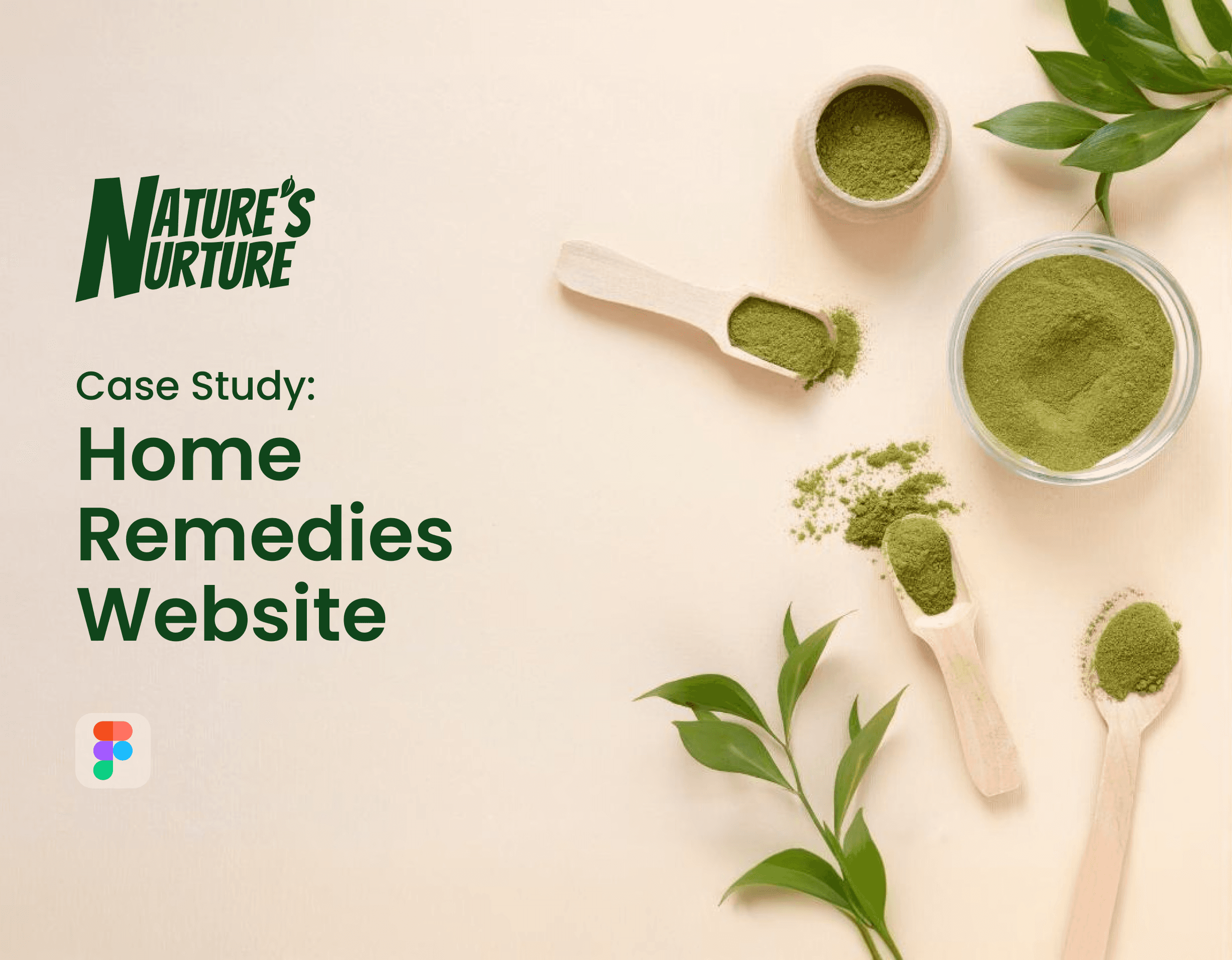
This case study takes you through the journey of designing Nature’s Nurture, a passion project that combines personal beliefs, family knowledge, and user-centered design. From understanding the problem to crafting a clear and educational experience — here’s how this idea came to life.
Project Overview
Nature’s Nurture is an informative website that encourages people to adopt natural remedies and healthy habits for common health issues like colds, headaches, or indigestion. It aims to bridge the gap between ancient wisdom and modern wellness by delivering curated information in a calming, easy-to-understand interface.
This project wasn’t built for profit — it was built out of a personal mission to promote preventive care and natural healing through thoughtful design.
Problem Statement
In today’s fast-paced world, people often turn to modern medicine for minor issues, unaware of the side effects or long-term impacts. While helpful in critical cases, over-reliance on pills for every problem can weaken natural immunity.
I needed to design a website that:
Educates users about natural alternatives
Builds trust through authentic, research-backed content
Presents information in a visually calm and credible way
Encourages people to take charge of their health without fear
Design Process
How I Achieved the Goal:
Grounded in personal stories and family knowledge, I followed the user-centered design approach to structure information and interaction in a natural, stress-free flow.

Our Approach: User-Centered Design
As this project is rooted in personal motivation, the design process followed the Design Thinking model — emphasizing empathy, clear problem framing, ideation, prototyping, and testing.
Stage 1: Empathize — Research User Needs

To gather real insights, I started by interviewing my family — especially those knowledgeable about natural diets and remedies. I also spoke with our family doctor to understand when allopathy is necessary and where natural care works better.
Key insights:
People often self-medicate out of urgency or lack of awareness.
Many don’t trust home remedies due to misinformation or poor presentation.
Visual clarity and tone matter when sharing health advice — it should feel gentle, not preachy.
Stage 2: Define — Clarify the Core Needs

Using my research, I defined the primary user needs:
A reliable space to explore natural remedies safely
A digestible format for learning about ingredients and benefits
Empathy-first communication, especially for skeptical users
These problem definitions guided every UI and content decision, helping me focus not just on appearance but purpose.
Stage 3: Ideate — Bring Clarity to Nature’s Message

Based on user needs, I began listing ideas:
Categorize by remedies, diet, and tips
Use illustrations and icons to aid readability
Include step-by-step procedures and dos & don’ts
Ideation helped shape the sitemap and interactions, keeping the experience friendly, focused, and educational.
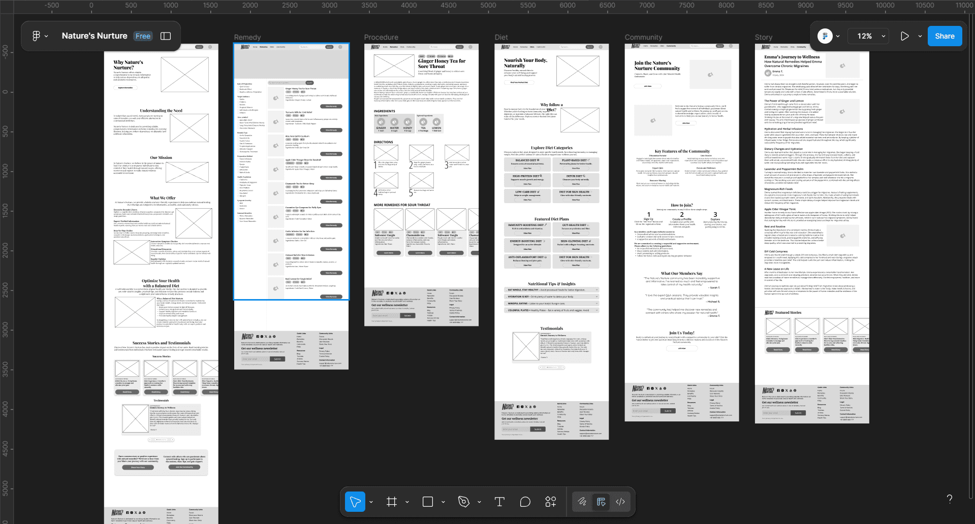
Stage 4: Prototype — Structure Before Style

I created low-fidelity wireframes to structure the layout — focusing on legibility, whitespace, and calm visuals. Each page had a clear entry point, with intuitive scrolling and gentle transitions.
Stage 5: Test — Feedback from Real Users

I shared early versions with friends and family to see if the content made sense, especially to those unfamiliar with natural healing. I also asked if the site felt trustworthy and readable.
Findings:
"Love the tone — feels personal and warm."
"Some sections could use better ingredient images."
"Can you add precautions with each remedy?"
Based on this, I revised content layout, added simple illustrations, and included safety tips with each remedy.
Visual Design

Logo Design
Before designing the interface, I had to name the project. “Nature’s Nurture” felt like the perfect blend of care and natural wisdom. As I’ve created logos in the past, it wasn’t hard to visualize it. I discussed rough concepts with friends and sketched ideas — until one version felt just right. The final logo reflects nature through soft greens and leaf motifs, paired with a calming typeface.
Screen Design
Each page of Nature’s Nurture was designed with intention — blending clarity with calm, and visuals with values.
Once the structure was confirmed via prototyping, I moved into visual design — adding earthy colors, soft rounded elements, and clear typography to reflect the nurturing vibe.
Home Page
Consists of all the details about the website and offers an overview of remedies, tips, and categories. Designed with a simple layout and focused colors to keep things clear.

Remedy Page
Lists of natural remedies based on symptoms like headache or cough, with step-by-step instructions and safety notes.

Procedure Page
Shows how to prepare the specific remedy. The layout is clean, minimal, and scroll-friendly.

Diet Page
Where all the diets are featured. Includes daily and weekly diet guides with seasonal food suggestions. Designed to feel like a wellness journal.

Story Page
Stories shared by users are featured — a personal space for sharing advice passed down from elders, full of warm, friendly design and visual cues.

Why Visual Design Matters
Visual design isn’t just about aesthetics — it’s about how people feel when they interact with your product. In wellness and health, this is even more crucial. A visually clean and calming interface makes information feel more trustworthy. It improves readability, reduces cognitive load, and encourages users to explore more.
For Nature’s Nurture, the visual design brought harmony between information and emotion. Every design choice — from the color palette to typography — was made to ensure users felt guided, not overwhelmed, and cared for, not sold to.
Outcome
Though this was a personal project, it received heartwarming responses from peers and mentors:
"This actually makes me want to try home remedies again."
"It feels like a gentle wellness coach."
It also helped me learn how to balance information clarity with emotional tone — especially in health-related projects.
Key Learnings
Tone of voice matters deeply in sensitive content like health
People trust visual simplicity when it comes to wellness
Family knowledge is a powerful resource when structured right
Early feedback makes a huge difference in content-heavy designs
Final Thoughts
Nature’s Nurture wasn’t just a design project — it was a personal mission. It reminded me how design can preserve wisdom, promote care, and inspire healthy change. The project deepened my belief in empathetic design and gave me new tools to present complex knowledge with clarity and warmth.