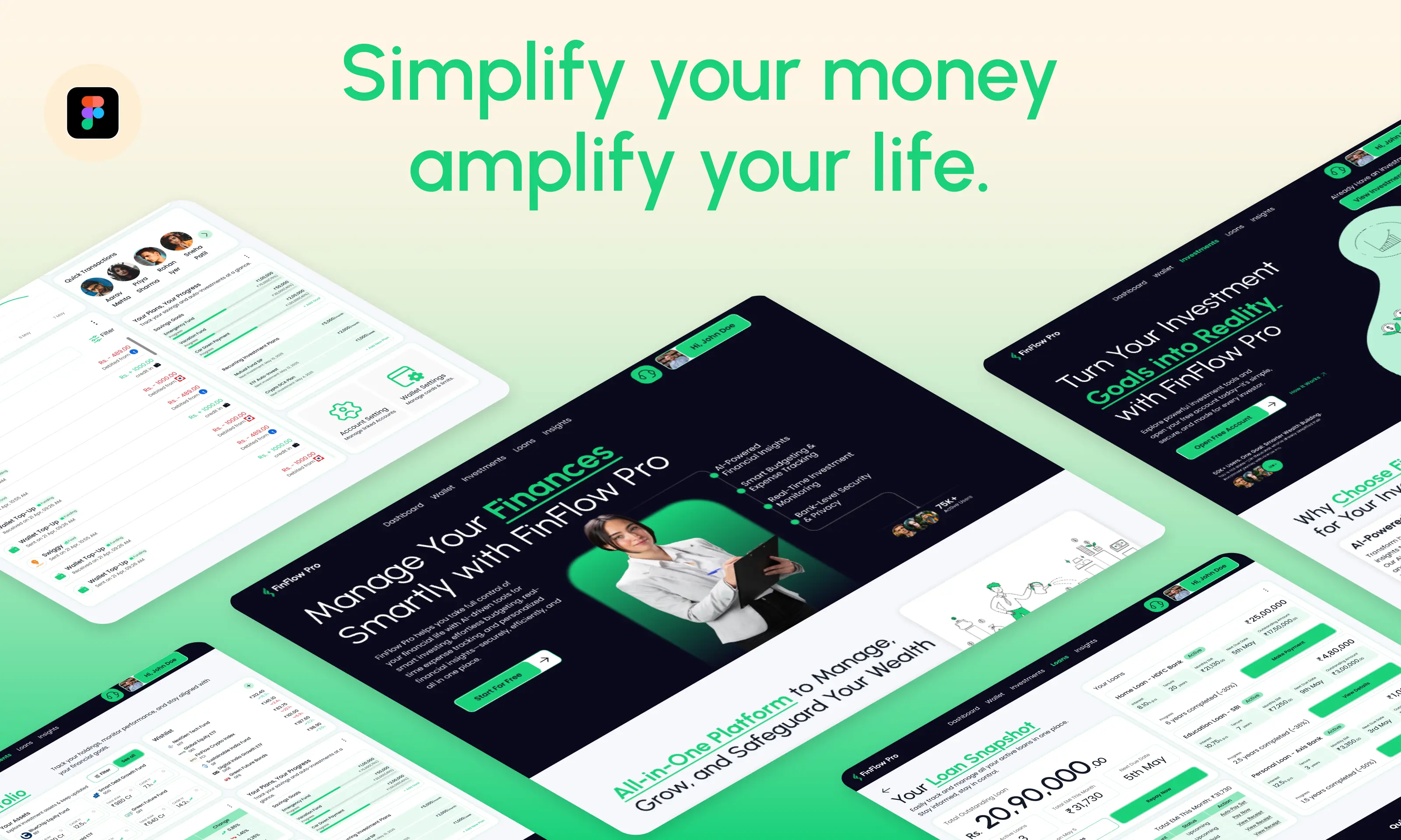
FinFlow Pro - Designing a Calm and Confident Finance Experience
In this case study, I'll walk you through the problems we encountered while designing FinFlow Pro and the step-by-step process we followed to solve them — from research and ideation to the final UI design. Let's dive into how we turned complexity into clarity.
Project Overview
FinFlow Pro is a web-based finance management platform designed to help users take control of their money — from tracking expenses and monitoring wallets to understanding investments and loans.
The client approached us with a clear pain point: existing platforms were too complex, visually overwhelming, or impersonal. The goal? Build a modern, clear, and helpful finance website that could make everyday money management effortless.
Problem Statement
Managing personal finances often feels intimidating. Most platforms rely on financial jargon, complex graphs, and rigid structures that make users feel more confused than in control.
We needed to design an experience that:
Presents data clearly and calmly
Makes navigation intuitive and flow-based
Builds user confidence without dumbing down important information
Design Process
How We Achieved Our Goal:
From understanding financial anxieties to designing a structured experience — here’s how we built FinFlow Pro, one step at a time.

Our Approach: User-Centered Design
Everything we did was rooted in empathy — because people don’t just want finance tools, they want to feel in control.
Adopting the User-Centered Design (UCD) process ensured that every decision was made with the end user in mind. In the financial space — where anxiety, trust, and clarity are make-or-break — this process was not just beneficial, it was essential. It helped us create not just an interface, but a confident experience that people could trust with their money.
Empathize — Research Your Users' Needs

We conducted secondary research and competitive analysis to understand user behavior, pain points, and gaps in existing fintech solutions. With help from ChatGPT, we were able to accelerate this research and extract actionable insights quickly.
Why is designing a finance experience important?
Users feel overwhelmed by complex dashboards and dense information
Many struggle with trust and data clarity, especially around loans and investments
A clean, calm, and structured interface can build confidence and help users make better financial decisions
With multiple apps doing different things, users crave an all-in-one solution that doesn’t overwhelm
Challenges in Finance App Design:
Jargon-heavy terminology discourages average users
Emotionless or mechanical interfaces create friction and distrust
Financial tasks (like budgeting or loan tracking) often feel stressful or confusing
Visual clutter leads to disengagement and missed insights
After understanding these behavioral and psychological patterns, we moved to explore how existing platforms solve these problems — and where they fall short.
Competitor Analysis:
We conducted a competitive analysis of popular fintech platforms including Paytm, Groww, Zerodha, and Razorpay to understand where they fell short and how FinFlow Pro could improve the user experience.
Desktop Website Experience
Features Offered
Insights:
Paytm is trying to be a financial super app — which sometimes affects clarity due to content density.
Razorpay is highly focused on B2B with a strong developer-first mindset and excellent UX clarity.
Zerodha is all about functionality and speed, targeted at serious traders.
Groww simplifies investments for beginners, keeping things visually light and minimal.
Key findings included:
Content overload — Paytm tries to be a financial super app, but its density affects clarity
Too focused on specific user groups — Razorpay targets B2B developers, and Zerodha appeals to serious traders, leaving average users underserved
Lack of emotional connection — Most platforms prioritize function over experience, with little attention to friendliness or visual comfort
Missed opportunity for guidance — While Groww is beginner-friendly, it lacks deeper educational support that could help users grow their financial confidence
These findings directed us toward a user-centered design approach that focused on simplicity, emotional engagement, and guidance — all while maintaining the depth needed for serious financial tasks.
Define — State Your Users’ Needs and Problems

We analyzed our research data to clearly define the challenges our users face, and what they truly need from a personal finance platform.
By framing these challenges as user-centered problem statements, we could ensure our design addressed real emotional and functional gaps — not just business requirements.
This stage helped us focus the design on solving the right problems, aligning features with actual user needs, and creating a more intuitive user journey.
Why We Created User Personas
User personas are fictional but data-driven representations of our target users. They help us humanize our audience, understand their goals, behaviors, and pain points, and keep the design process user-focused.
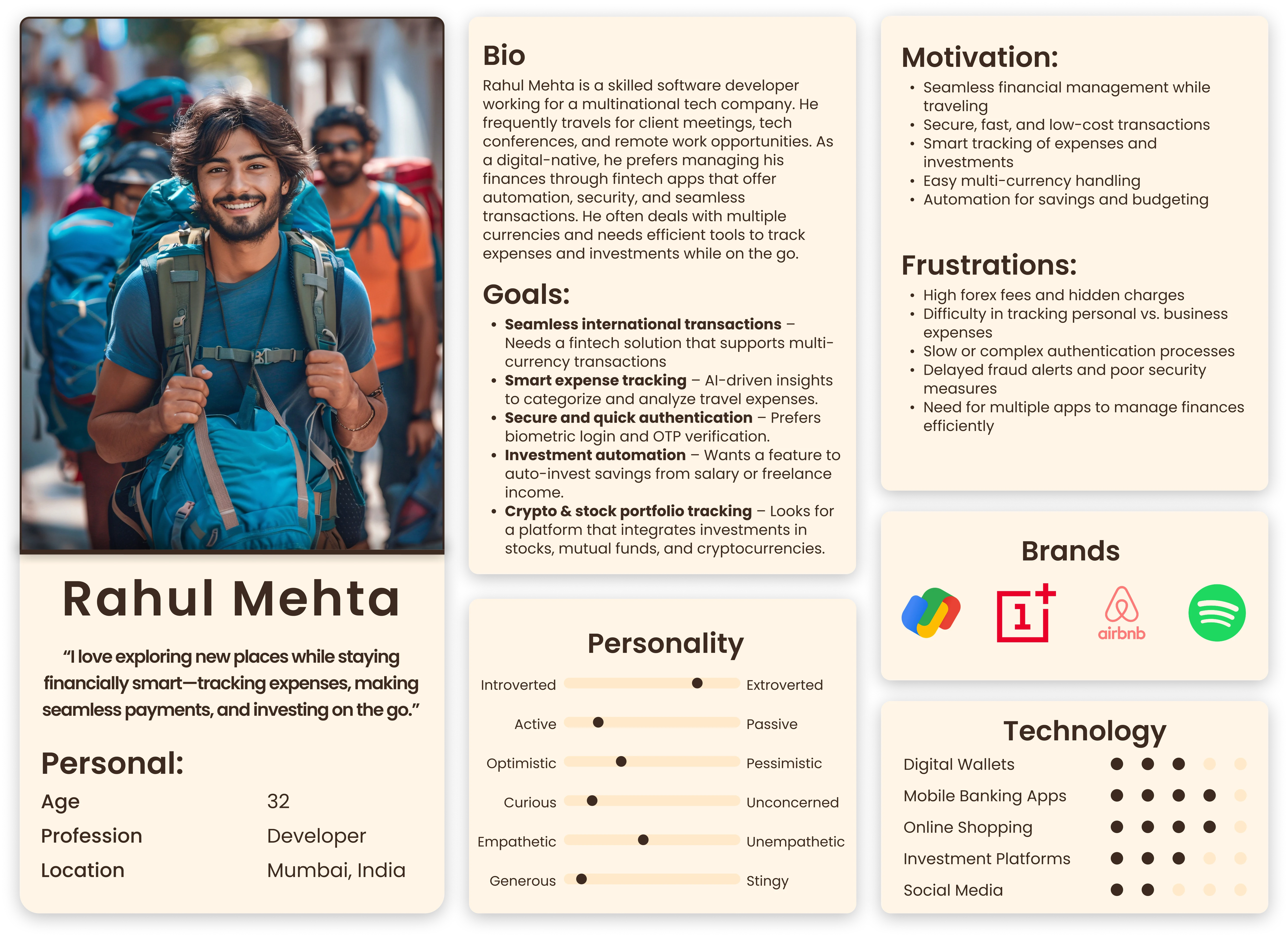
How Personas Helped in FinFlow Pro
For FinFlow Pro, creating detailed user personas allowed us to:
Identify diverse user needs — from young professionals tracking expenses to experienced investors managing portfolios.
Prioritize features and content based on real user goals rather than assumptions.
Design clear, intuitive flows tailored to each persona’s financial literacy and tech comfort level.
Build empathy within the team, ensuring every design decision considered the users’ motivations and frustrations.
Avoid one-size-fits-all solutions, instead crafting an experience that felt personal, approachable, and useful for different types of users.
By grounding our work in user personas, we were able to deliver a finance platform that truly met the expectations and challenges of our varied user base.

The Ideate stage is where we generate a wide range of ideas to solve the problems identified in earlier phases. This involves brainstorming, sketching, and exploring different concepts without limiting creativity. The goal is to think beyond obvious solutions, challenge assumptions, and come up with innovative ways to meet users’ needs.
This stage is crucial because it helps avoid rushing into design with a single idea. Instead, it encourages divergent thinking, exploring many possibilities, before narrowing down to the most promising solutions.

How Ideation Helped in FinFlow Pro
During FinFlow Pro’s ideation phase, we:
Challenged assumptions about what users wanted by exploring ideas beyond traditional finance apps.
Brainstormed features that could simplify complex finance tasks like investment tracking and loan management.
Developed ideas focused on clear navigation, emotional calmness, and user empowerment.
Prioritized solutions that balanced depth of information with ease of use, ensuring even beginners could feel confident.
Created early sketches and flow diagrams to visualize interactions and user journeys.
This creative exploration ensured that the final design was both innovative and user-friendly, helping us deliver a finance platform that stands out for its clarity and calm user experience.
Prototype — Start to Create Solutions

Wireframes are low-fidelity blueprints of the product that help visualize layout, structure, and content placement without the distraction of colors, fonts, or images. Creating wireframes is a crucial step because it allows teams to focus purely on user flow, hierarchy, and functionality.
Benefits of Wireframing:
Clarifies layout and structure early: Ensures everyone is aligned before visual design starts.
Saves time and effort: Identifies usability issues early without needing to redesign high-fidelity screens.
Encourages feedback: Stakeholders can focus on functionality and flow without being influenced by visual aesthetics.
Enhances collaboration: Serves as a communication tool between designers, developers, and clients.
Reduces cognitive load: Helps spot visual clutter or interaction bottlenecks by simplifying the interface.
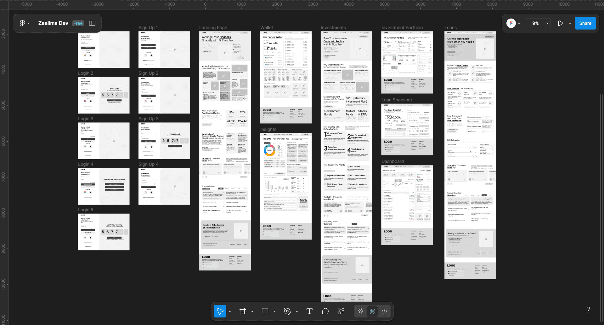
How It Helped in FinFlow Pro
For FinFlow Pro, wireframes played a foundational role in:
Structuring complex finance data (like transactions, investments, and loans) into clear, intuitive sections.
Designing consistent layouts across pages like Dashboard, Wallet, and Insights.
Improving navigation clarity by visualizing flows between key actions (e.g., viewing EMI breakdown, switching wallets, checking returns).
Aligning early with stakeholders on the overall feel and flow of the product before committing to visuals.
Testing core interactions like CTAs, tab bars, and filters with quick revisions.
Thanks to wireframing, we created a more focused, user-friendly layout that set the stage for a clean and calm final UI — staying true to FinFlow Pro’s goal of making finance simple.
Test — Try Your Solutions Out

The testing phase is where we put our ideas to the test — literally. After building wireframes and visual mockups, we observe how real users interact with our designs to uncover pain points, gather feedback, and refine the user experience. It's not about perfection; it's about learning what works, what doesn’t, and why — so we can improve before final development.
This phase is crucial because it turns design assumptions into validated, user-backed decisions. It ensures the experience we’ve imagined actually resonates with the people we’re designing for.
Why Testing Matters
It allows us to validate design decisions through real-world use
We catch usability issues early, before development
It provides a clearer picture of how users feel during interactions
Helps align stakeholder expectations with user needs
Gives room for iterative improvement, which leads to better outcomes
How It Helped in FinFlow Pro
In the case of FinFlow Pro, usability testing gave us actionable insights that shaped the final experience:
We discovered areas of visual clutter that were simplified for better readability
Users struggled with generic CTAs — we replaced them with clear, goal-driven actions
Spacing and layout tweaks made the interface feel more open and digestible
Feedback emphasized the need for trust cues (like labels, icons, and tone) around sensitive data
Stakeholders gained clarity on what users valued, leading to strategic refinements — especially in the onboarding and Insights section
Key Benefits We Gained
Validated user flows and interface logic
Reduced friction through clearer interaction patterns
Increased emotional comfort and trust — essential for a finance product
Ensured the product was not just functional but also friendly and supportive
Thanks to testing, we didn’t just design for users — we co-designed with them. This phase was pivotal in making FinFlow Pro feel simple, secure, and human.
Visual Design
Crafting a visual language that feels calm, confident, and modern.

With the user experience confirmed through prototyping and testing, it was time to bring the interface to life with thoughtful visuals — including branding, typography, colors, and layout. Our goal was to create a look that felt trustworthy and empowering, while staying visually light and friendly.
Logo Design: Where It All Began
Before diving into the visual design, I first worked on crafting the name and logo for the platform. We wanted something that conveyed both financial clarity and ease of use — that’s how FinFlow Pro was born.
Having designed logos in the past, I had a fair idea of what would work well for this product. The process was intuitive and collaborative:
We brainstormed as a team and discussed what the logo should evoke — trust, modernity, and simplicity
I visualized different directions and shared quick sketches
After a few rounds of informal team feedback, we aligned on a clean, minimal logo that reflects movement and financial flow
Once finalized, I digitized the logo, keeping the design sleek and balanced — aligning perfectly with the overall calm and composed tone of FinFlow Pro.

UI Design: Bringing It All Together
Once the design was tested and approved in the prototype phase, I moved on to crafting the high-fidelity UI. This involved selecting a soft, optimistic color palette, clean typography, and modular layouts that made the platform feel spacious and digestible.
Each screen was tailored to simplify finance — here’s how each one was structured:
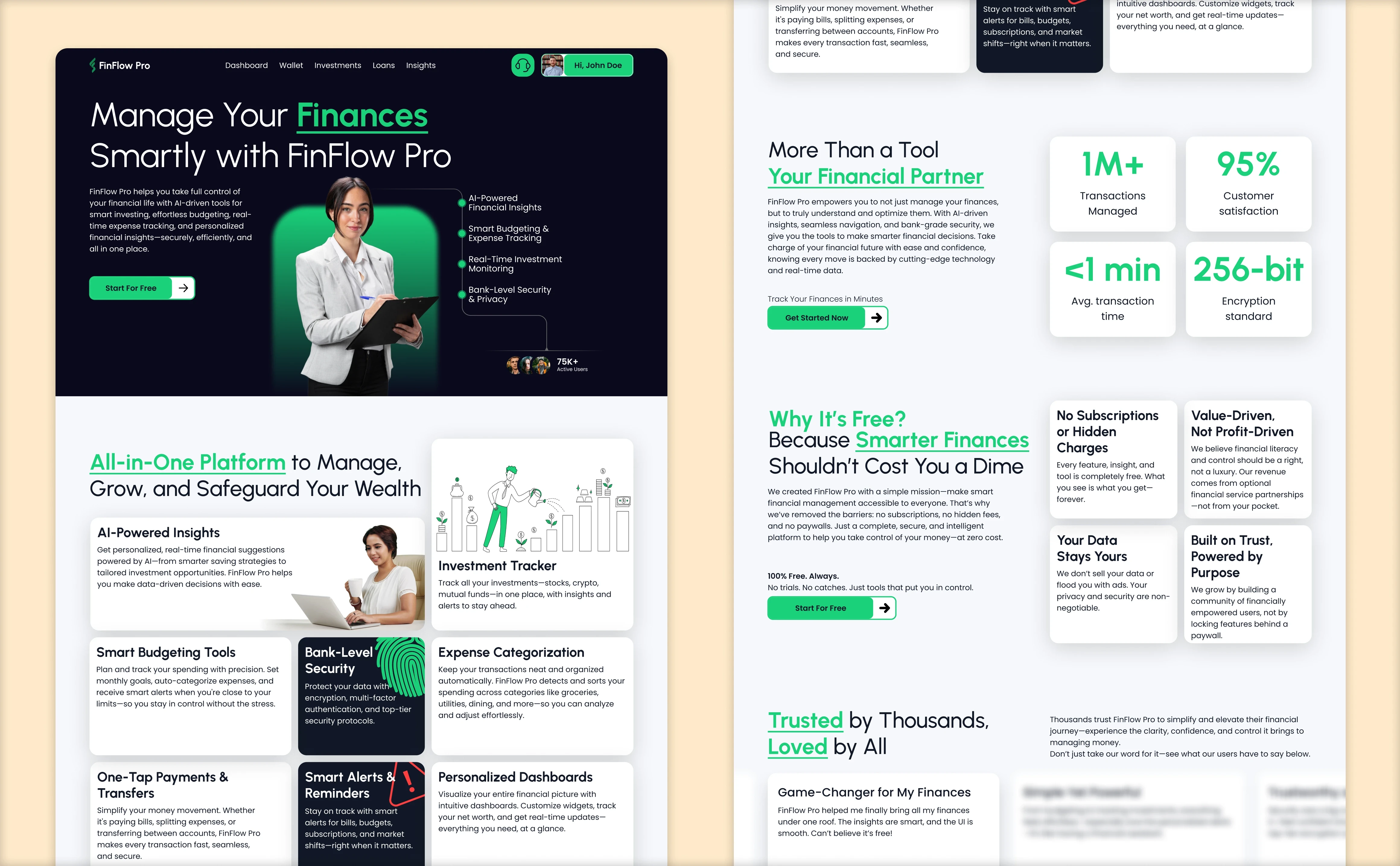
Home Page
The homepage sets the tone — it introduces the platform and communicates its key benefits. We designed it using a bento-style layout to make content scannable and visually organized.
Design Focus:
Clear headline and subheadings
Balanced white space for readability
Accent colors used to guide the eye
Visual hierarchy that leads users gently through the content
Dashboard
During research, we learned that users don’t want to be overwhelmed by data the moment they log in. So, the dashboard only includes what’s most important:
A summary of recent transactions
A minimal weekly graph of income vs. expenses
A section for quick transactions
Linked cards and bank accounts
Design Focus:
Calm data visualization
Quick actions at a glance
Personalized, not generic
Wallet Page
Since users were already familiar with digital wallets, we leaned on established design patterns to reduce the learning curve.
Design Focus:
Familiar layout for intuitive navigation
Categorized transactions
Focus on balance visibility and quick actions
This page was designed to feel immediately usable and dependable.
Investments Page
We wanted to make investing feel less intimidating and more accessible. The main investment page educates users on:
Types of investments available
Benefits of investing via FinFlow Pro
A simple, guided process to open new account
From here, users can navigate to their Investment Portfolio Page, which shows:
Assets owned
Total returns
Performance trends
Risk insights
Design Focus:
Educational yet light
Trust-building through clean visuals
Detailed breakdowns made digestible
Loans Page
The Loans section educates users and gives them control. It explains:
Loan categories available
Benefits of using FinFlow Pro for loans
Step-by-step guide to apply
It also includes a built-in EMI Calculator, allowing users to preview their repayment amounts in real time.

This screen links to a Loan Snapshot Page, which includes:
Active loan amount
Next due date
Repayment progress
Transactional history
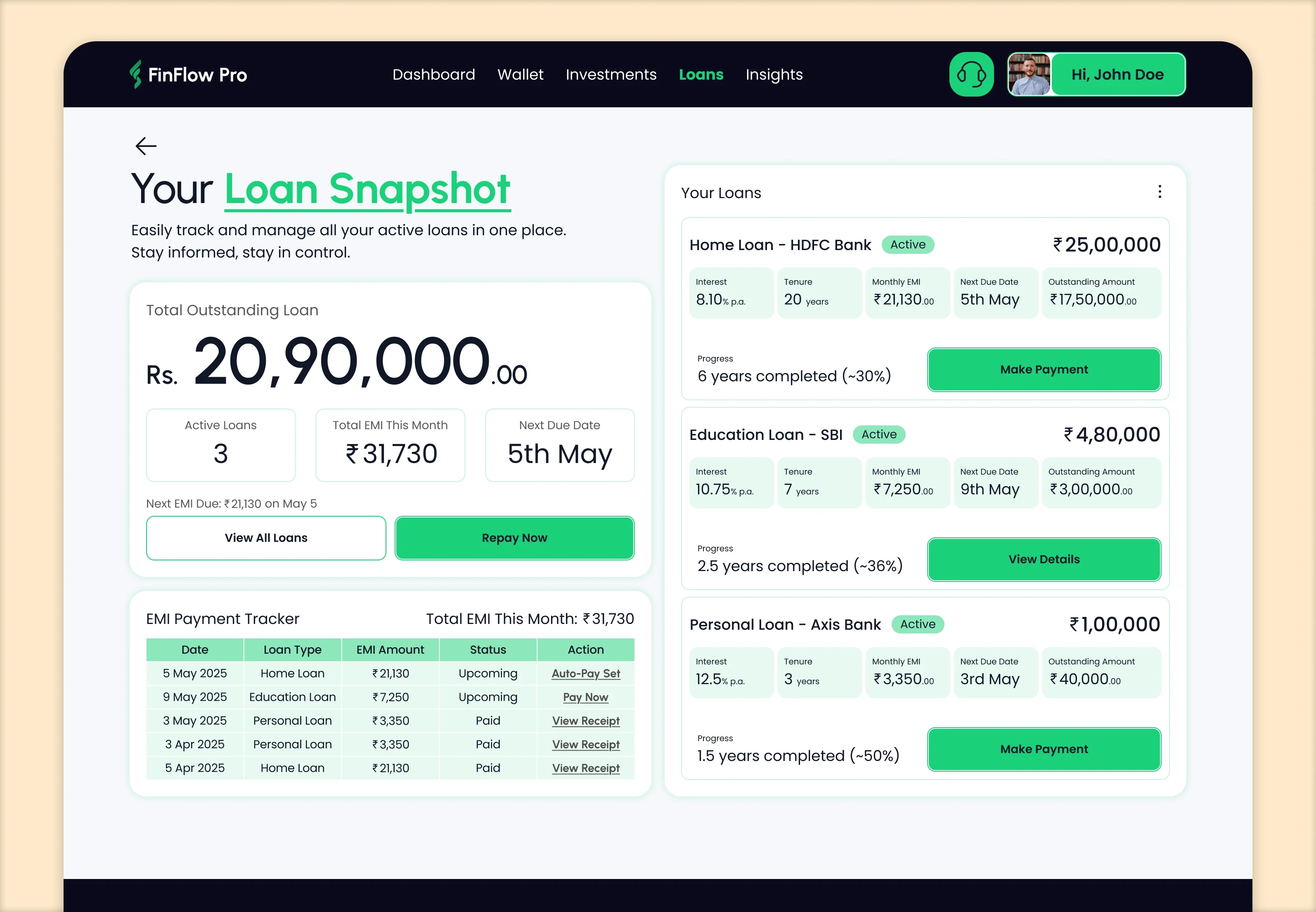
Design Focus:
Financial transparency
Ease of comparison and tracking
Functionality without visual overload
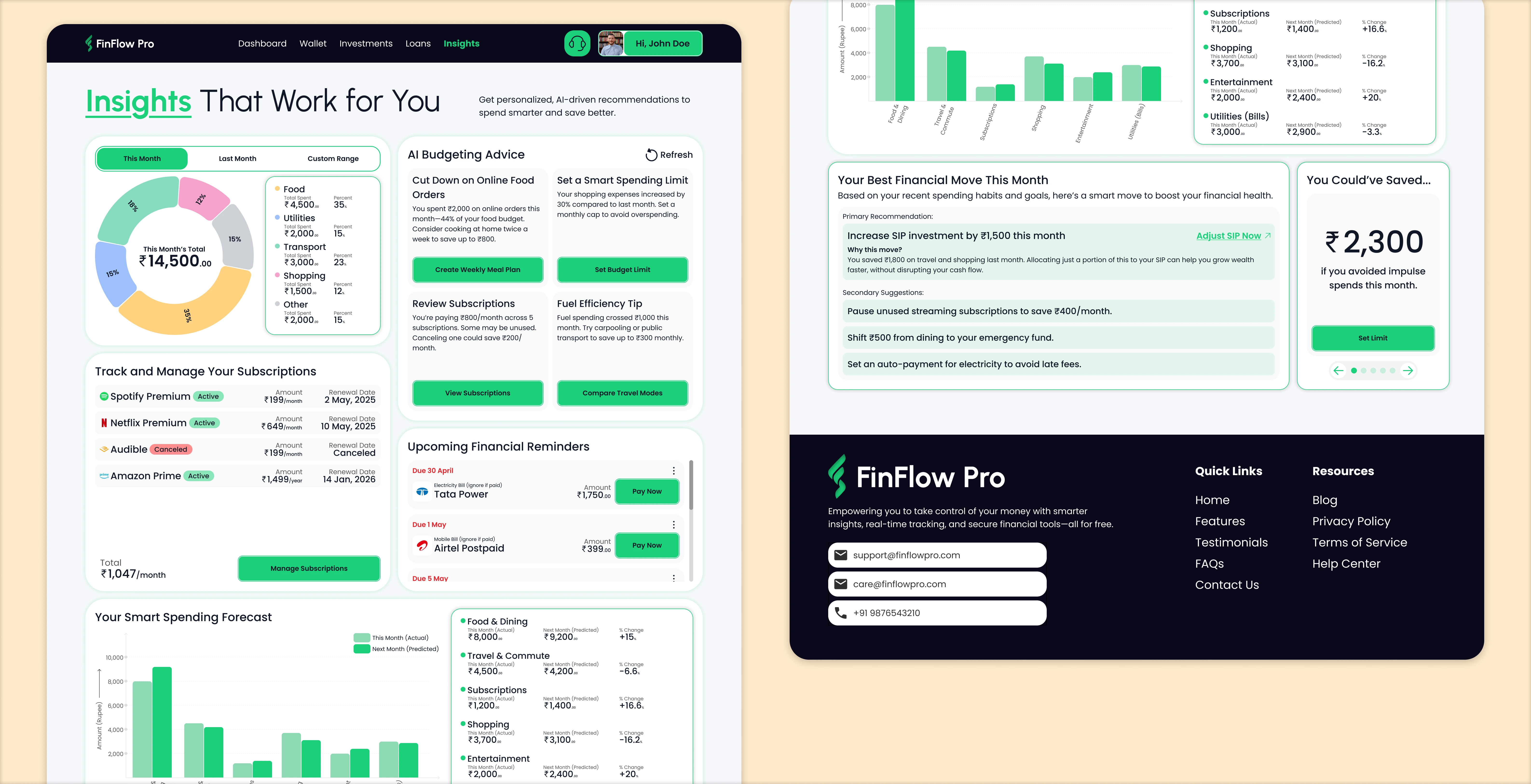
Insights Page
The Insights page acts like a financial coach. It gives users a clear picture of their money habits, including:
Categorized spending analytics
Subscription tracking
AI-generated financial advice
Forecasting tools using predictive analysis
It uses AI to project future spending trends based on past data, helping users make smarter choices.
Design Focus:
Visual storytelling through graphs and tiles
Interactive suggestions
Emotional connection via tone and personalization
Why Visual Design Matters
In a category where products often feel sterile or intimidating, the visual design of FinFlow Pro was crucial. It helped:
Build trust through consistency and simplicity
Reduce financial anxiety with soft visuals
Make features feel usable and human, not technical
Design isn’t just decoration — here, it was a tool to create emotional comfort, clarity, and control.
Key Learnings
This project wasn’t just about screens—it was about understanding financial emotions, teamwork, and balancing logic with empathy.
Here’s what stood out:
Empathy unlocks clarity: Spending time understanding financial stress helped us design calm and thoughtful solutions.
User feedback is gold: Even small usability walkthroughs brought big design improvements.
Design is collaboration: From logo discussions to prototyping, this project reminded me that great ideas emerge through open team conversations.
Wireframes are underrated: They allowed us to solve layout issues early, so we could focus on polishing details later.
Testing prevents surprises: Finding and fixing issues before the UI phase saved time and avoided late-stage chaos.
Final Thoughts
Designing FinFlow Pro was a rewarding journey—not just for the output we delivered, but for the clarity and calm we were able to bring to something as intimidating as finance.
We didn’t try to reinvent the wheel. We just made it roll a little smoother.
From ideation to interface, this project reaffirmed my belief that user-centered design isn’t a buzzword—it’s a responsibility. When you’re designing tools people use to manage their money, you’re not just shaping screens. You’re shaping decisions, emotions, and futures.
And if we made that a little easier, a little friendlier—then the design did its job.